


UPDATED SEPTEMBER 13th
- Added new NHL 08 Chicago Blackhawks jersey screenshots.
- Added new NHL 08 Saint Louis Blues jersey screenshots.
- Added new NHL 08 Edmonton Oilers jersey screenshots.
- Added new NHL 08 San Jose Sharks jersey screenshots.
- Added new NHL 08 Atlanta Thrashers jersey screenshots.
- Added new NHL 08 Atlanta Thrashers jersey screenshots.
- Modified Anaheim Ducks jersey image.
A big thank you to Sherry, who did a wonderful job while I was away, be sure to check out her awesome Senators blog over at Scarlett Ice.
Check out NHL Tournament of Logos if you are dying for more logo and RBK jersey talk.
If I have missed one or you have one (confirmed, unconfirmed or speculated) you'd like to submit, email me at mailto:mbbrblog@gmail.com or leave a comment!


Buffalo Sabres

Calgary Flames


Carolina Hurricanes
Calgary Flames
Carolina Hurricanes


Dallas Stars (?)


Detroit Red Wings Florida Panthers Montreal Canadiens Nashville Predators Ottawa Senators -BBeR

Edmonton Oilers

(Original post)

Los Angeles Kings
(Thanks to Life in Hockeywood)


New York Islanders
(Thanks/merci Xordok)
(original story)


OTT jersey update:

Philadelphia Flyers
Phoenix Coyotes
(from an XBOX gaming magazine)
-click here for a hi-res version-
Pittsburgh Penguins
 San Jose Sharks
(View official slideshow here)
St. Louis Blues

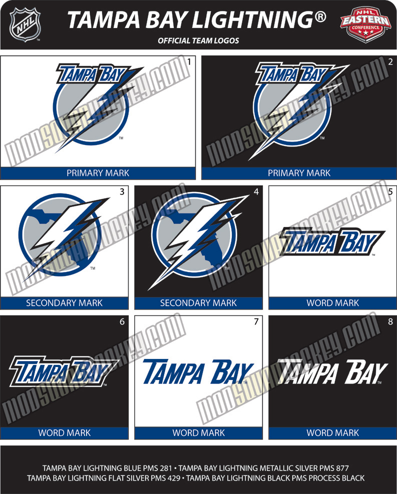
Tampa Bay Lightning
(view entire logo changes here
TAM jersey update:


Toronto Maple Leafs
Vancouver Canucks


Washington Capitals


124 fanatics have replied:
The only one I have doubts on is the Islanders' Jersey, it somehow looks strange...
No one is sure about that Isles jersey..I hope it's not real at least. :)
...i have to say, these aren't as horrific as i've been expecting. I thought they all were going to have that roadkill "pattern" underneath the arms like the Sabres' new ones do. The Bruins look like...well, the 70s Bruins.
Dammit, I love the tie-up front. Everyone should adopt that.
-rob
I Want It and Isleschick:
No one's sure, but if we take a look at how the other jerseys are designed (striped across the chest, lined), then we can assume that it is in fact the new Isles jersey for next year, it wouldn't follow the "concept" if it was any different than in the photo.
Rob- I have to agree, I thought they were ruining the game by changing everything around, but they actually made it better, though I'm still worried about the new Habs jersey...hope they didn't screw it up!
If the Isles jersey is real, why would it be of Yashin?
I donno, maybe it was made before he was gone.
Indeed, they would have been made THAT EATLY ???
Yeah, what, you think they designed and manufactured these new jerseys in the last 2 weeks.
Come on man.
Last time I checked, it takes more than 2 weeks to design and make a jersey.
I took those Kings pictures. Those are the real deal. Check out more at www.lifeinhockeywood.com
There is no way in hell that is the new Islanders jersey. I simply cannot believe that. Prototypes. Failed prototypes.
Don't mess with a classic. Please NYI brass, keep the existing jersey as is. If you have to do something, bring back the old blue. That's the only change I could accept.
the NHL just does NOT get it at all. the jerseys can technologically change for the better but the colors are still the same. can someone PLEASE tell me why everyone in pro sports is obsessed with navy blue ?? the islanders jersey, is stupid looking and just a marketing change to generate revenue that's for the most part needless. the stars jersey is looking like a softball jersey from a beer league. and the new buffalo sabres jersey is modeled after the san diego chargers. the chargers have one of the best all time sports uniforms.........but for some dumbassed stuborn reason they won't completely adopt it. the new uni's are still navy with powder trim. the alternates are powder with navy trim.
someone tell me why the need for all of the dark colors, especially navy ???????
the best uni's the NHL had were the old cap's, leafs, habs and sabres.
if you're going to shell out 250.00 or so for a new jersey, do you want one that looks just like 20 other teams/lemmings ?????
these dumbassed marketing idiots are insulting our intelligence.
oh wait, scoring is down so we'll just make the goal bigger.
Lifeinhockeywood anonymous- They're awesome, thanks for taking pictures of 'em! I'll be sure to link back to you!
goldenkody-It's all about marketing dude, the new NHL style translates into a new NHL jersey, more modern, I guess the NHL is really looking to get as far away as possible from the old days before the lockout, but I think it's dumb if they really believe changing jerseys, rules and crap all the time is good for the game.
I, for one, like the new jerseys and can't wait to see 'em next year!
They couldn't keep the same ones forever, you have to change eventually.
I really love the Bruins, Columbus, and Kings jerseys.
I am really hoping I will warm up to the Canes home jersey. Perhaps once I see the real thing it will be better? We won't get to see the finished product until September 16th at the Caniac Carnival, so I suppose I will pass judgement then.
Is Dallas going to go play Football after every game in those jerseys?God I hate the new Sharks logo.Too much like a cartoon and too orange.
Yeah they do look kind of football-like.
Haha, I guess they could fool the average fan as a football team if they wear football equipment and those jerseys.
There's no way those are the official San Jose Jerseys.
They are patterned after this fan concept:
http://nhllogos.blogspot.com/2007/07/new-sharks-jersey-design-concept_28.html
And still include the old fin shoulder logo which is no longer an active mark, in any way.
Still, you have to give credit to whoever it was that created those jerseys and imported them into whatever version of NHL hockey they have there. Some impressive work.
I agree with the comment about Dallas. Those look horrible. I just hope the Wings keep with the Rangers and stay the same.
That Dallas uniforms is fake. It's just a photoshopped image of Bostons new uniform from their website and then taken a picture phone pic of it to hide the flaws.
The Dallas Stars Ice Girls will have red in one of their uniforms. Rumor is that one of the Stars jerseys will have red in it as well.
Im praying that isnt the new stars jersey. that looks horrible.
The actual Wings shirt is shown here: http://www.freep.com/apps/pbcs.dll/article?AID=/20070815/SPORTS05/70815046&imw=Y
jkrdevil: Thanks for pointing that out, I did some investigating, turns out it was indeed a fake.
To some recent anoynymouses:
Well, the Stars need to lose that number in the front then, to me it looks like a crappy attempt to create a football oriented hockey jersey.
And as for the Wings, thanks for the link!
I'm glad the Stars and Isles are copying the Sabres...I believe that slug logo still sucks and sales were primarily motivated by the team's good play. I hope the Sabres wind up going with their Vintage when they bring it back in 2008-2009.
-Charlie From SabresNotSlugs.com
the islanders jersey is the latest insult to long island fans...
i PRAY the leafs don't similarly screw up (the bruins, rangers and redwings didn't apparently), but given their management history over the past 40 years i wouldn't bet against it. a horrendous design would be another nail in their coffin. sigh.....
http://nhl.imageg.net/graphics/product_images/p3536337dt.jpg
http://nhl.imageg.net/graphics/product_images/p3536332dt.jpg
I love those new NYI jerseys.. :)
I hope the Habs will keep their last year 3rd jersey (the 1945 one!) as their main white one.. I hate the red shoulder pads.. !!!!!
And the new Senators Logo is CLASS!! Real nice.. I love how the NHL is redoing everything this year.. This rocks!!!!! It's seriously a new NHL!! (Except for the tens of millions given to players, again!)
Here's a nice site for those interested in the history of the NHL teams logos:
http://www.sportslogos.net/league.php?l=1
I'm a little weary about that Canucks uniform... that green doesn't look right. I suppose it could be the quality of the photo, as it appears to have been taken with a cell phone. It seems that the team will mix the modern logo with the classic colours though...
That Tampa logo is horrendous! What is wrong with that team? They could easily have an OK logo if they lost the 2 different fonts of Tampa Bay and Lightning, and just had a circle with a lightning bolt through it.
those dallas jerseys are their old ones with a different design on them.. i use them for my team except we use the flames C
http://bp3.blogger.com/_r8tWGVHrjGI/Rs3VzJXYKEI/AAAAAAAABW0/EA7ba4IWKpA/s200/oilblue.jpg
This looks like the oilers jersey from the magazine
Yep, looks like that, I'll consider putting it up next time I update.
if that is the new canucks jersey- its the best of the lot!
if the leafs projection is valid they have screwed up once again- sigh...
I'm really hoping the Canucks color scheme looks the way the prototype on here is. It's a great mix of the old school sweaters with a little influence from the Whale...which is always an awesome thing, cause I really dug those Whalers sweaters
It's amazing how the Islanders get it wrong EVERY time. From the Gourton's fisherman to the old logo with teal in the jersey, to the hideous orange home 3rd jesery of the past few seasons, to this disaster. Go back to the jersey you wore the first 3 seasons in the league.(Orange on white #'s)with the new rebook look.
The new RBK jerseys seem to be heavily influenced by soccer designs--colored seams, body darts and sleeve stripes. They're okay, but teams could have adopted their practice jerseys and we wouldn't have have been the wiser. I wish designers would keep in mind that logos and uni designs have to be recognizable from at least the mezzanine seats (Anaheim take note!). Also, plain pants look like they were ordered in bulk from the local hockey shop. Side stripes show off more leg movement and speed.
it is da real isles jersey it was posted like that in newsday. and its GAY!!!!!!!!!!!!!! LETS GO RANGERS
hahahaha.
Does it make me a bad person that I basically like them all except the Leafs and that is just on principal?
Like the new Canucks except for the wordmark. Would be okay if it was just on the away, not on the home.
I think all the Islanders haters should hold up on the criticisms for a few minutes to take a look at the new Flyers jersey. As of right now, my team has the worst RBK jersey in the league. Calm down Islanders fans, you're not the bane of the Atlantic Division anymore.
And for the record, the new Habs jerseys are the classiest RBK jerseys yet.
i have lived in the trenton nj area for a long time.... being born in toronto- i am a life long leafs fan and have feared that the new sweaters would be worse than the islanders- but then i saw the flyers posting- when they chose that monstrosity ed snider must have been at home drunk in malibu!
AWFUL! looks like shirts worn by hawkers for boardwalk games at the jersey shore! there is still hope! (PLEASE NO MORE NUMBERS ON THE FRONT)!
wow what a surprise the 2 gayest and worst teams in the atlantic division have the most homo jerseys. YES I AM REFERRING TO THE FLAMING ISLANDER AND FLYERS jerseys. The islanders 3rd jersey will probably have a big penis inside a heart. NYR4LIFE BABY!!!!! BROADWAY BLUE TAKING IT ALL!!!!!!!
Hahahahaha.
Funny.
The Avs jersey looks horrible. The two-tone sleeves, the underarm gussets being a different color, the vertical piping, the giant RBK logo on the back, the complete lack of any horizontal elements on the hem...it's just bad all around.
The big question is "Where are they going to put the C?"
Can't stand the new Sharks logo and the Jersey design is even worse.
As a Sharks fan, this new design is just disgusting. If they couldn't make a better jersey than the black, alternate one they should have just left it all alone ugh...
I don't think they're that bad. After looking at all of them, probably the Bruins and the Habs are the nicest. I don't know why people need to take shots at the Isles, but the sweaters are better than most and the team will surprise most people as well.
LET'S DROP THE PUCK ALREADY!
the canucks jerseys with the "Vancouver" across the front is simply a way to sell jerseys to tourists during the Olympics in 2010. this idea is being talked about quite a bit in vancouver.
Lh9WdW You have a talant! Write more!
nA1paY Please write anything else!
UZZF0Y The best blog you have!
cs6OAF Nice Article.
Nice Article.
Hello all!
actually, that's brilliant. Thank you. I'm going to pass that on to a couple of people.
actually, that's brilliant. Thank you. I'm going to pass that on to a couple of people.
Thanks to author.
actually, that's brilliant. Thank you. I'm going to pass that on to a couple of people.
Please write anything else!
Nice Article.
iNNk40 write more, thanks.
Nice Article.
Nice Article.
actually, that's brilliant. Thank you. I'm going to pass that on to a couple of people.
Thanks to author.
actually, that's brilliant. Thank you. I'm going to pass that on to a couple of people.
Magnific!
Good job!
Magnific!
Nice Article.
Wonderful blog.
Hello all!
Oops. My brain just hit a bad sector.
Build a watch in 179 easy steps - by C. Forsberg.
Give me ambiguity or give me something else.
If ignorance is bliss, you must be orgasmic.
What is a free gift ? Aren't all gifts free?
When there's a will, I want to be in it.
When there's a will, I want to be in it.
Wonderful blog.
What is a free gift ? Aren't all gifts free?
Lottery: A tax on people who are bad at math.
Magnific!
Energizer Bunny Arrested! Charged with battery.
Give me ambiguity or give me something else.
Wonderful blog.
Magnific!
Change is inevitable, except from a vending machine.
I don't suffer from insanity. I enjoy every minute of it.
When there's a will, I want to be in it.
Beam me aboard, Scotty..... Sure. Will a 2x10 do?
Suicidal twin kills sister by mistake!
When there's a will, I want to be in it.
Please write anything else!
A lot of people mistake a short memory for a clear conscience.
The gene pool could use a little chlorine.
Hello all!
Oops. My brain just hit a bad sector.
Nice Article.
Suicidal twin kills sister by mistake!
Suicidal twin kills sister by mistake!
Please write anything else!
The gene pool could use a little chlorine.
What is a free gift ? Aren't all gifts free?
What is a free gift ? Aren't all gifts free?
The gene pool could use a little chlorine.
If ignorance is bliss, you must be orgasmic.
Friends help you move. Real friends help you move bodies.
Build a watch in 179 easy steps - by C. Forsberg.
What is a free gift ? Aren't all gifts free?
Clap on! , Clap off! clap@#&$NO CARRIER
Hello all!
If ignorance is bliss, you must be orgasmic.
Friends help you move. Real friends help you move bodies.
Good job!
Friends help you move. Real friends help you move bodies
Suicidal twin kills sister by mistake!
Clap on! , Clap off! clap@#&$NO CARRIER
All generalizations are false, including this one.
Calvin, we will not have an anatomically correct snowman!
Build a watch in 179 easy steps - by C. Forsberg.
Give me ambiguity or give me something else.
Nice Article.
A flashlight is a case for holding dead batteries.
Please write anything else!
Post a Comment