The NHL is rapidly changing, and RBK Hockey is leading the way in the appearance department.
After shockingly overtaking hockey God manufacturers, CCM and Koho 3 years ago and revolutionizing the way hockey equipment looks and feels, they're at it again.
But this time, it's in a delicate category named "jersey", and if their presentation at the ASG is any indication, then the hockey world will be the first professional sports league to don such an advanced piece of fabric technology.
But just how revolutionnary will the new NHL jersey be?
If you missed their little promo at the ASG, here is RBK's concept of that advanced piece of fabric technology.
The Boston Bruins and Washington Capitals are the first to reveal their "new" jerseys for the upcoming season.
Techincally, the Bruins have a new logo, and their jersey will essentially be the same in terms of colours and design.
The Capitals, however, have gotten out of that dark and ugly jersey they have worn for so many years.
Oh and it was dark...play-by-play men and commentators have trouble reading the player's name and number behind the jersey.
Presenting your 2007-2008 Washington Capitals jersey
(If you have Adobe Flash Player installed, go to Washington's website and check out "the way it should be" for yourself)
From left to right: Ben Clymer, Brian Pothier, Chris Clark and Jeff Schultz.And I guess we can read the numbers now too:

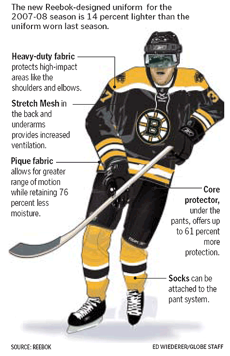
An excerpt of the "Bruins new jersey" article per the
Boston Globe.comToday, the Boston Bruins will unveil the new Reebok uniform, the first NHL team to show off the sleek look with tighter-fitting jerseys and advanced moisture technology. The Bruins also are one of six teams that are using the introduction of the uniform to change their logo and striping, bringing back a vintage look reminiscent of the Bobby Orr era and showing that the redesign is about profit as well as performance.Alright, I'll get to the point already, here's what the Bruins' 2007-2008 logos will look like, and if you're curious, here's how the B's logo has evolved over the years (for some reason, the link to bruins.com doesn't work anymore)

There isn't much of a difference at all.
The "B" on the primary logo is a bit wider and more rectangular, while the "BOSTON" on the vintage crest is bolder and black rather than .
Anyway, to sign off, I love these new concept designs, and I can't wait to see them in action next October!
--BBR


